Yelp Re-Design
Finding problems with Yelp’s desktop experience and solving them.
Project Background
Three participants were asked to complete various tasks while interacting with the website, allowing me to observe and identify areas for improvement.
Objective
To find 3 problems with Yelp’s desktop website experience and provide solutions.
Process

Initial Questionnaire
For the users who have used Yelp before, they are asked the question:
“Are there things that you don’t like about Yelp’s interface?”—the goal of this step is to immediately obtain user problems before going through the task analysis.
Task Analysis
Users are asked to complete a set of common tasks on Yelp’s website; during this process users are asked questions—this method is known as contextual inquiry. Users are also encouraged to voice any thoughts aloud that arise.
If the user was able to complete the task, they are asked to give a 1-to-5 usability rating (1=unusable, 5=perfect) and to justify it. If the user could not complete the task, they are given the answer and asked to give their qualitative opinion on it. Data is collected with screen-recording software and note-taking.
Narrowing Down the Problems
At this point, several problems have been found via the initial questionnaire and task analysis— they are narrowed down to three.
The three problems chosen are the ones most commonly shared among the user group, and most in need of a substantial re-design.
Solving the Problems
The three chosen problems are analyzed, and re-designs of the interface are created as solutions.
were found.
3 problems
were found.
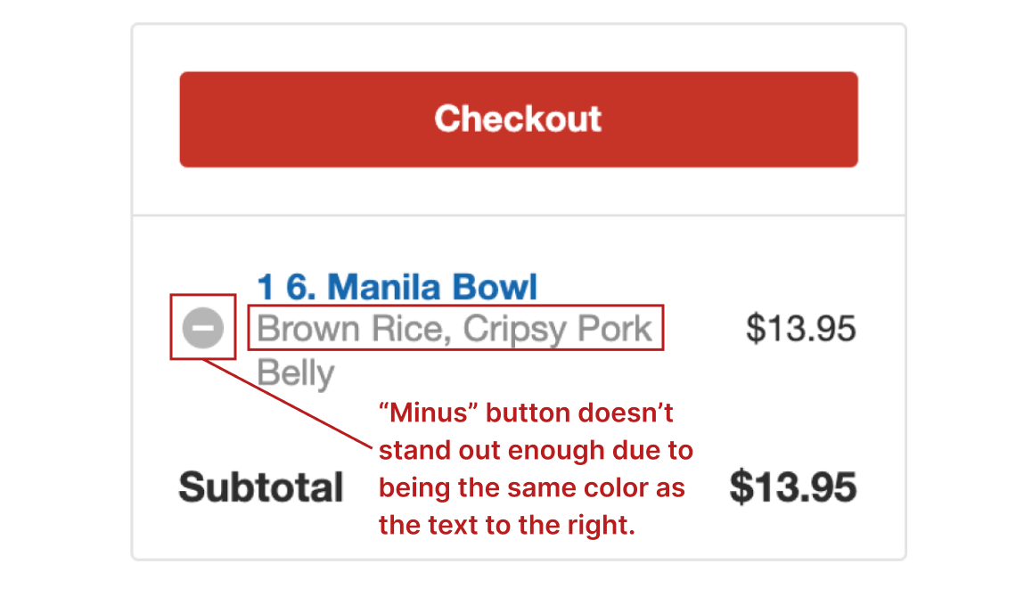
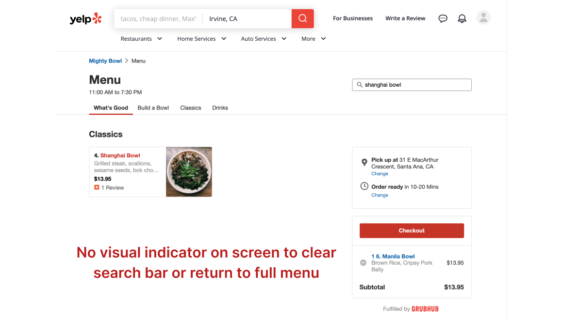
The interface for ordering food has two usability issues.
The Collections page has two usability issues.
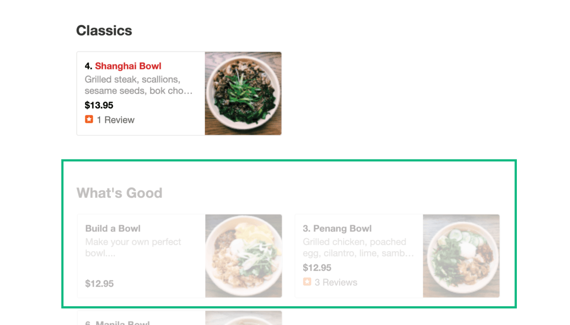
It takes too much time to view the entire restaurant menu.
Problem 1
The interface for ordering food has two usability issues:

1/3 users
could not remove items from cart.

2/3 users
were unable to return to the full menu after searching.
Why is this a problem?
Task Analysis #1:
Users are told to remove an item from the cart.
Result:
1/3 users could not complete the task.


Task Analysis #2:
Users are told to search for “Shanghai Bowl” by using the “Search Menu Items” bar and then return to the full menu.
Result:
2/3 users could not complete the task.

users could not return
to the full menu.

Interpreting the Results
Solution for Problem 1
Before
After


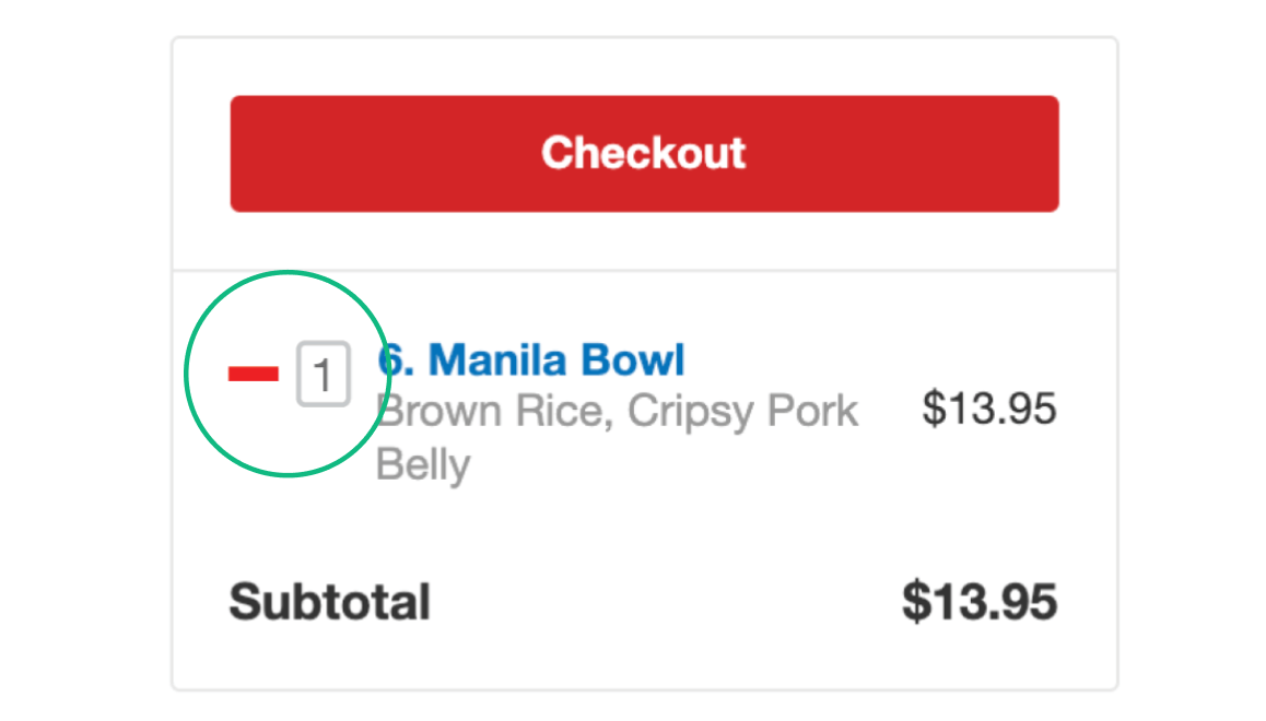
Minus button is turned into a red minus symbol and a quantity field is added to the right.
Quantity field allows user to edit quantity without having to open a pop-up window. Typing in “0” will also remove the item.
An “X” button is added to the “search menu items” bar.
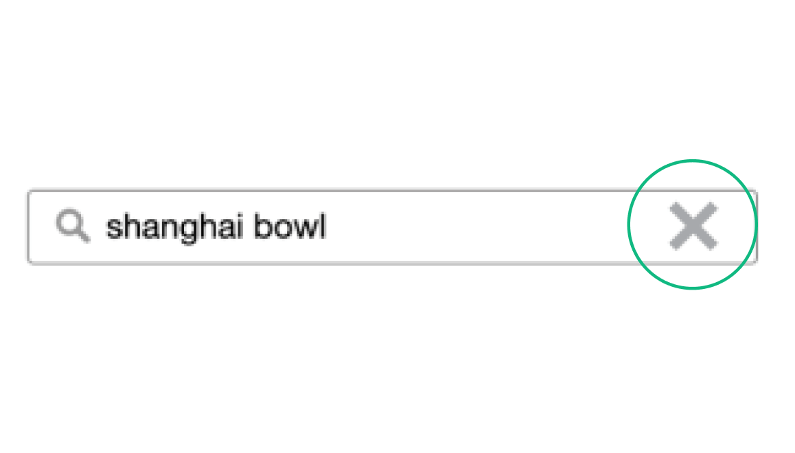
Menu items are still visible with lower opacity when keywords are present in the search bar—clicking on them will also clear the search bar.
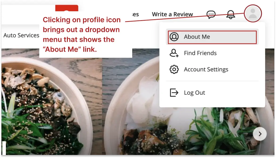
Problem 2
The “Collections” page has two usability issues:

2/3 users
could not find the "collections" page.

1/3 users
could not remove items from the “Collections” page.
Why is this a problem?
Task Analysis #1:
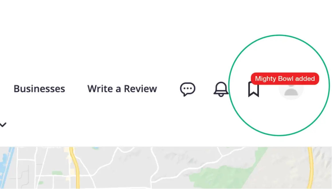
Users are told to save “Mighty Bowl” to the “Asian Restaurants” collection and then find the “Collections” page.
Result:
2/3 users could not complete the task.

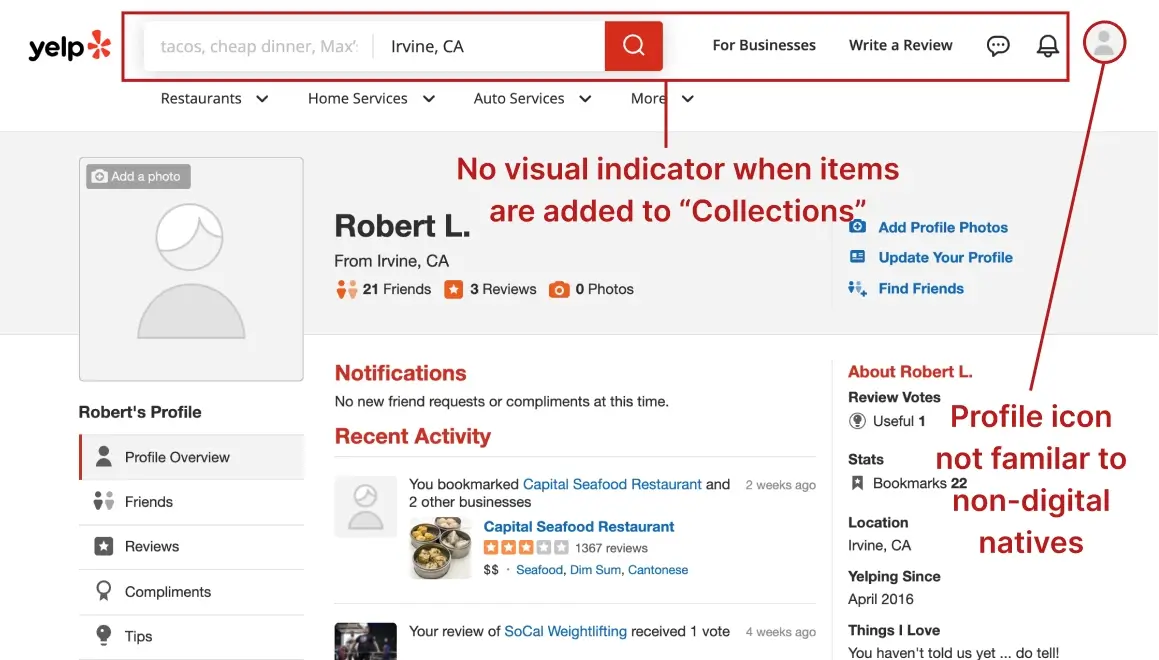
“I’m not good with technology, the profile icon in the upper right is not familiar to me.”
Task Analysis #2:
Users are told to remove “Mighty Bowl” from the “Asian Restaurants” collection.
Result:
1/3 users could not complete the task.


Interpreting the Results
Solution for Problem 2
Before
After


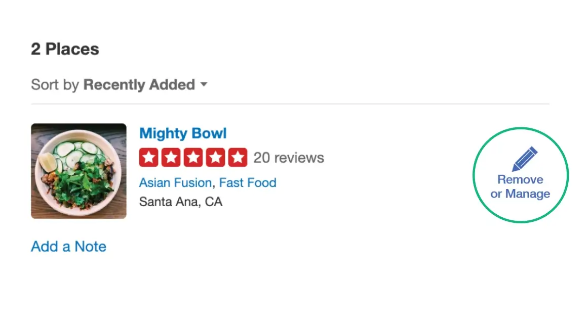
The red “bookmark” icon is changed to a pencil icon with the text “Remove or Manage” underneath.
An icon for “collections” is added to the upper right navigation. A red box is displayed briefly each time a new item is added.
Problem 3
It takes too much time to view the entire restaurant menu.
Why is this a problem?
Task Analysis:
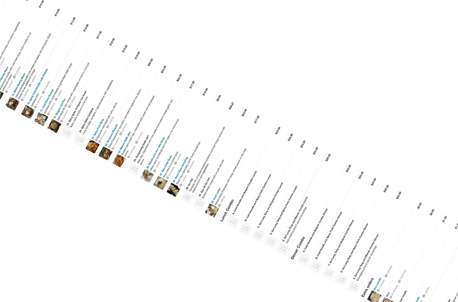
Users are told “Read the restaurant menu and pick items as if you were going eat there.”
Result:
3/3 users scrolled to the bottom.
2/3 users scrolled back up and down the menu.

•From a restaurant with a large menu.


“Because I’m going through the menu and trying to decide what I want.”
Interpreting the Results
Solution for Problem 3
Before
After


