LiftTrackr
A new way to track and organize your lifting videos.
What is LiftTrackr?
LiftTrackr is a mobile app geared towards recording, logging, and organizing videos of your workout exercises quickly and efficiently.
My objective for this project was to create a comprehensive design system and project file in Figma that showcases two things: my ability to collaborate with other designers, and my ability to provide developers with well-defined assets—ensuring a seamless transition from design to code.
Project Journey
Creating Content
Choosing the subject matter for this project.
When it came to choosing the subject matter for this project, I decided to focus on making a mobile app that solves a personal issue—LiftTrackr. As someone who does olympic-style weightlifting as a hobby, I like to record my lifts to make sure my form is correct. The problem is that my phone gallery is full of unnamed lifting videos, and it is impossible for me to search for specific videos based on metadata. It is also hard to distinguish between each video just by thumbnail alone.
Although the subject matter itself is not the primary focus of this case study, it provides a practical context for the development of the design system and project file.
Information Architecture
User personas, storyboards, & wireframes.
Creating LiftTrackr's information architecture was the first step towards informing my design decisions for the design system and prototype—user personas, storyboards, and wireframes all work synergistically together in accomplishing this task.
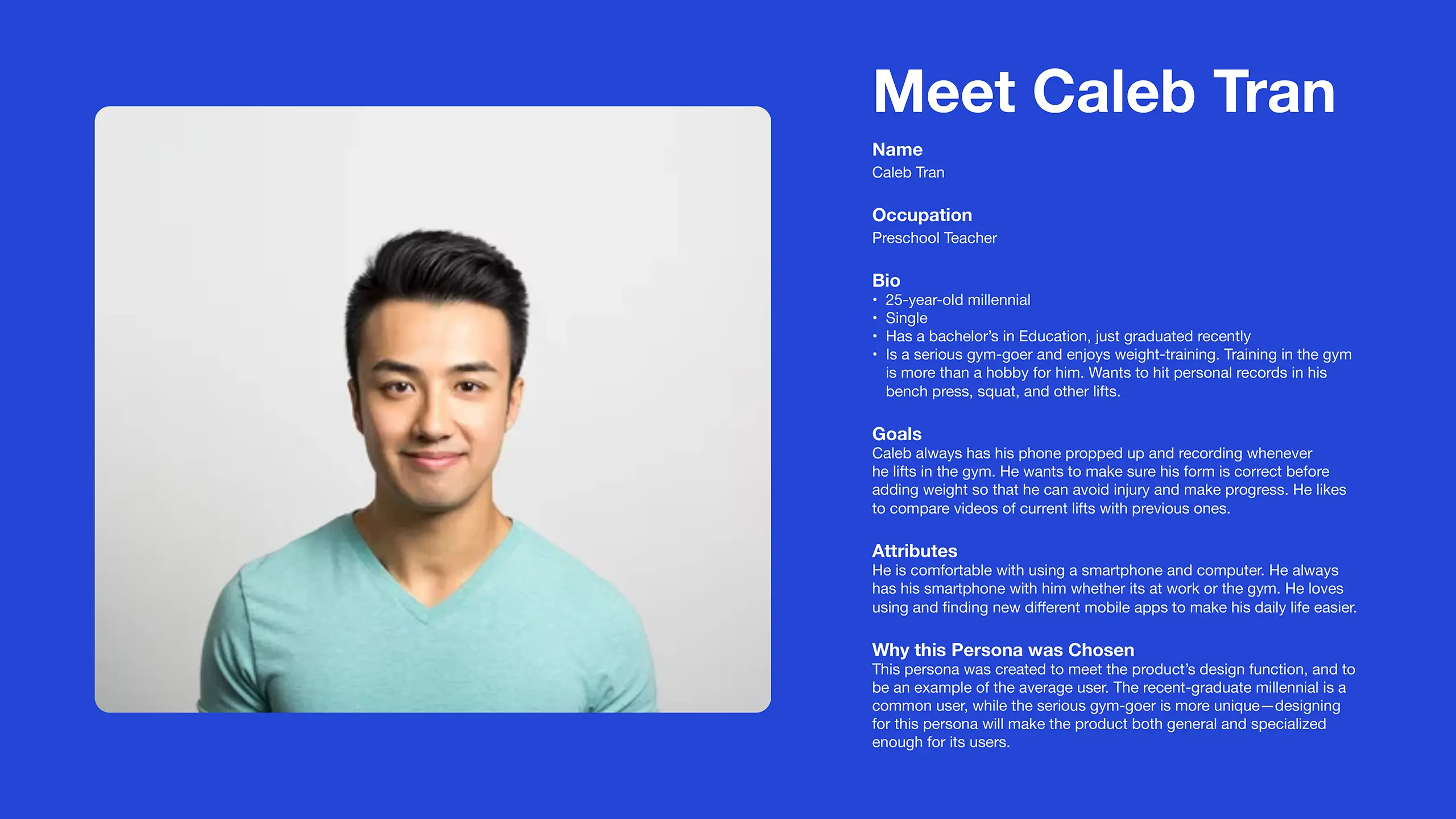
1. User Persona
When creating the user persona for LiftTrackr, I combined aspects of my own experience with assumptions about the common user.
The purpose of creating a user persona was to inform design decisions that align with their goals and preferences, and provide the starting point for the storyboard—the next step towards mapping out the information architecture.
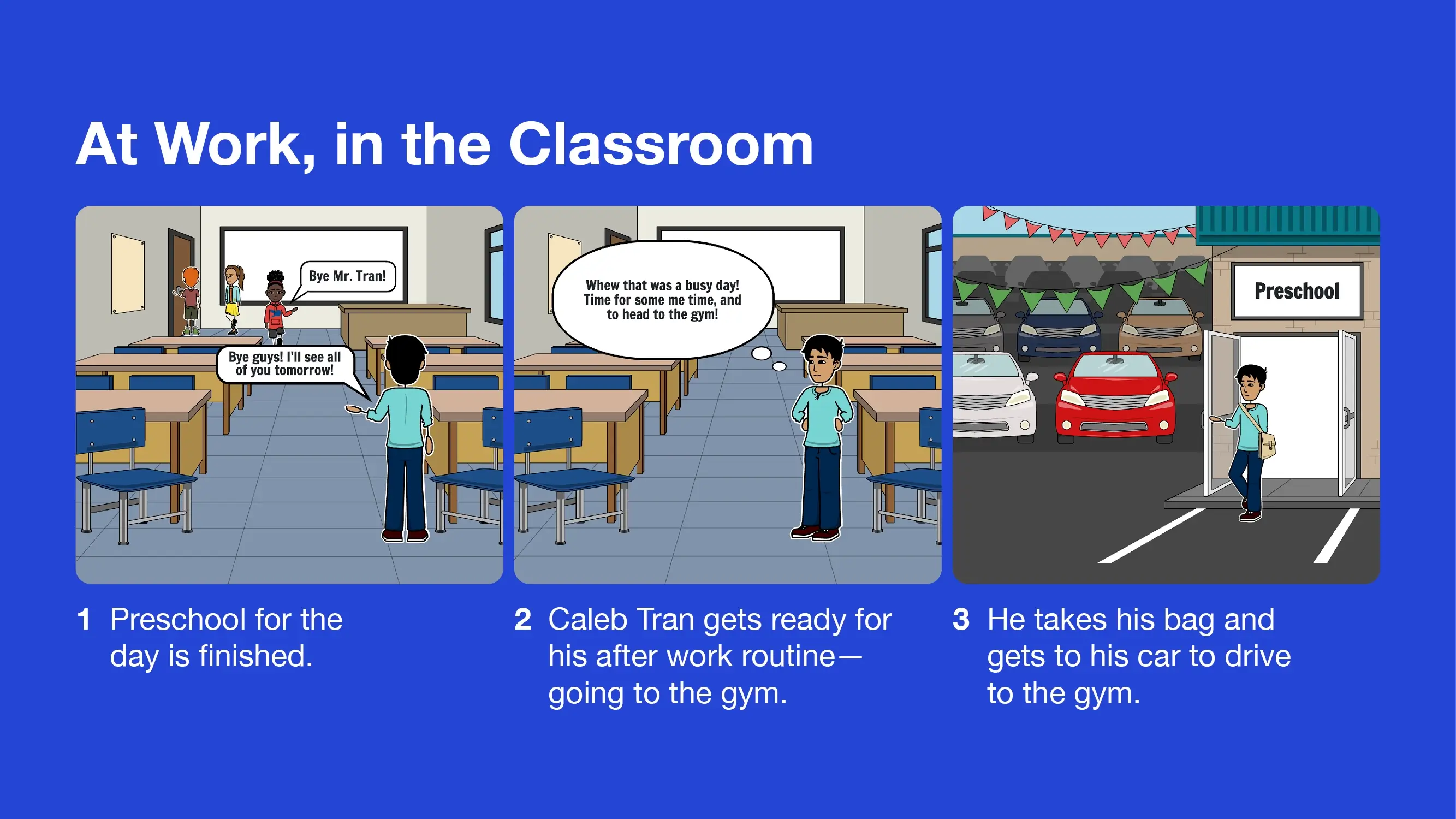
2. Storyboard
With the help of a tool called Storyboard That, I created a visual story showing how my user persona uses LiftTrackr to solve his problems.
The storyboard served as a exploration of real-world usage scenarios, enabling me to discover key features and functionalities essential to the app—these insights led to the development of user flows and features to be incorporated into the wireframe design.
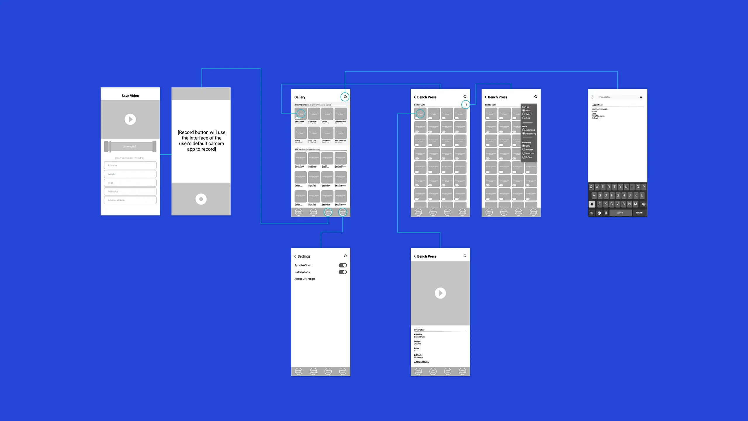
3. Wireframe
Using the insights from the user personas and storyboard exercises, I created wireframes that visually mapped out the user flows and informed what elements would need to be turned into components.
For this project I didn't stick to the wireframes too strictly; during the final design phase I would add additional screens, user flows, and features that aided my goal in showcasing a comprehensive design system/project file.
Creating the Design System
Created with collaboration in mind.
With the wireframes completed, I started on the design system file by first setting up in a way that facilitates collaboration between other designers.
Below is an overview of my process and some key aspects of the design system. Click on the button below to view the design system file in its entirety.
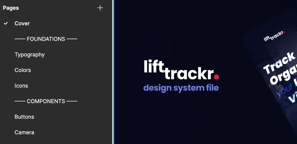
1. File Structure
The first step was setting up the Figma file in a logical way that facilitates collaboration with other designers on the same team, and to be used as a valuable resource for developers. The pages of the design system file are divided into two groups: Foundations and Components.
Foundations include Typography, Colors, and Icons—these are also known as the "atoms" or basic building blocks that all elements of the design system are comprised of. I would explain to developers to focus on adding in the foundational elements first in the development cycle, as they form the backbone of the design system.
All components are organized by alphabetical order, and include elements such as buttons, navbars, modals, etc.

2. Creating the Logo
While I normally created logos in Adobe Illustrator as a graphic designer, I’ve always thought that the power of auto-layout and components in Figma would be a great way to create variations of a logo within a brand—this is how LiftTrackr’s logo was born.
The word “Lift” in the logo has its baseline shifted up via auto-layout to convey the feeling of a weight being lifted, while the red dot at the end of the logo represents a recording dot. By using the main logo as a master component, I was able to quickly create variations to be used as page titles on different screens and allow the branding to be repeated throughout the entire app.
3. Color Styles
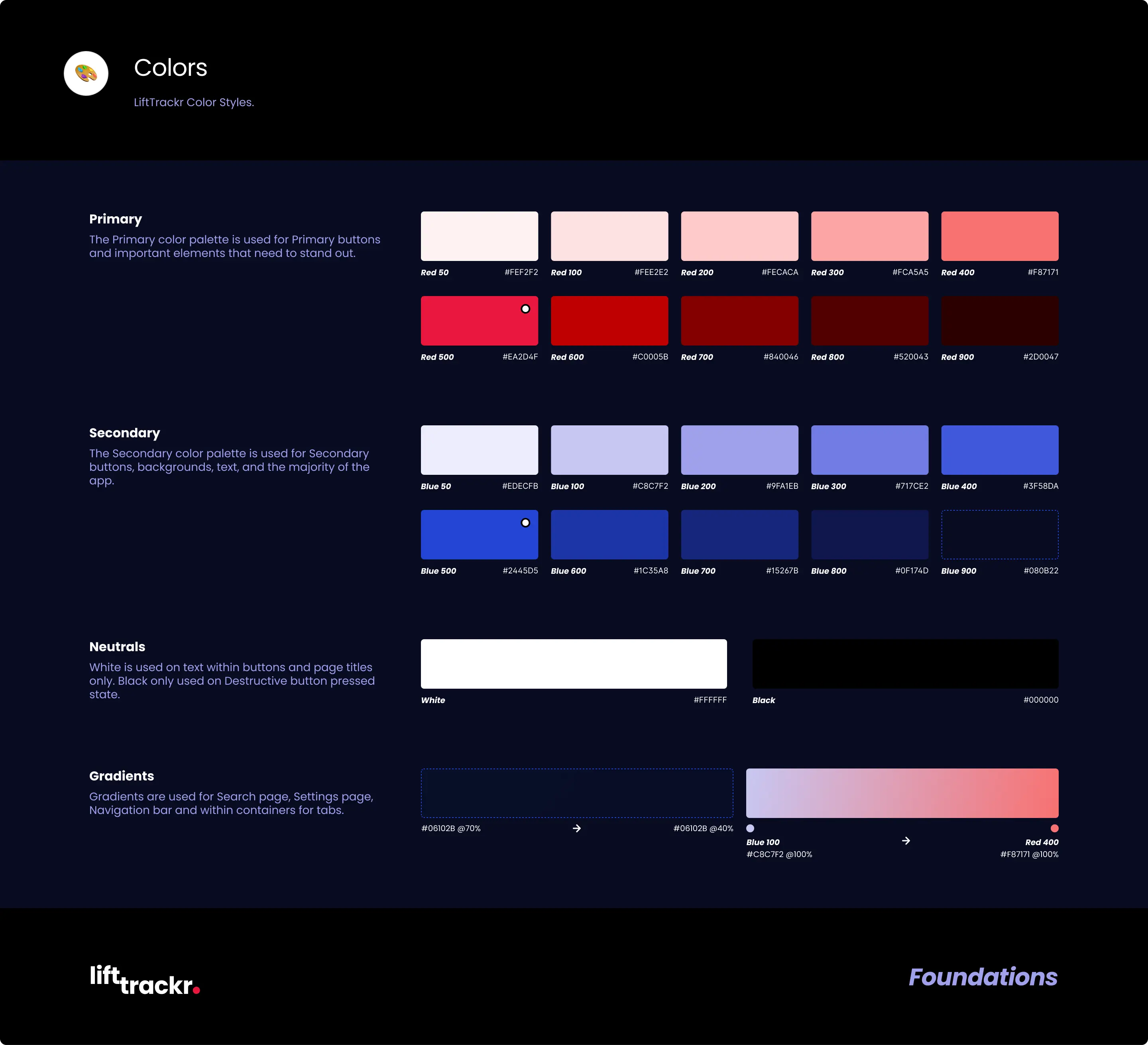
The creation of the logo served as the launching point to discovering what colors I would include in the design system. All color styles are on the "Colors" page, and include descriptions on use case, hex codes, and naming conventions.
I knew that the color red would be an important color, as it is the color of the recording dot in the logo—therefore it was the logical choice for the primary color.
Blue is used as a secondary color—with red as the primary color this creates a complimentary color palette that gives the energy and contrast I wanted for LiftTrackr's role as a fitness app.
One of the difficulties of using red and blue together is that the contrast can be too much, especially in an app that is supposed to be used as a gallery. As a solution, I decided to mix some blue into the red and vice versa to make the color contrast less harsh, and allow the video thumbnails to be more prominent.
The Figma plugin Color Designer is used to quickly create tints and shades for each color. I referenced Tailwind CSS’s naming convention (Tints: 50–400, Base: 500, Shades 600-900) as it is a familiar framework to most developers.
4. Type Styles
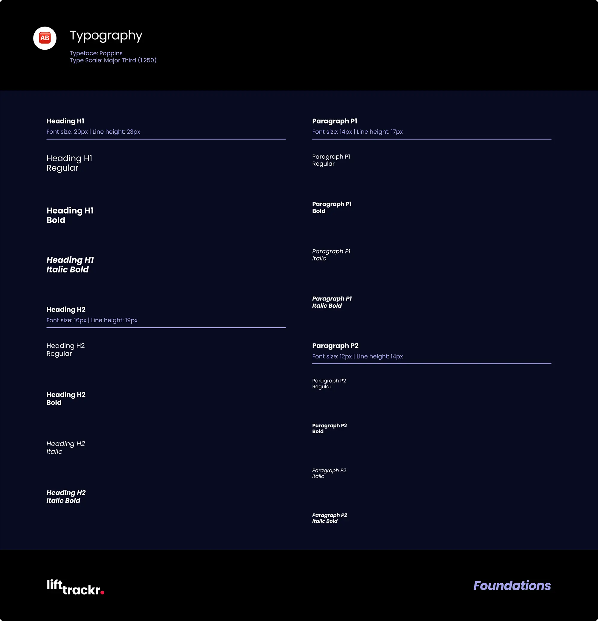
After the color styles, I created a page for type styles that includes naming conventions, weights, font sizes, and line height.
The wireframe helped me decide what type sizes and how many type style would be needed for the design system.
The typeface Poppins is used in the logo and in the design system's type styles. I liked its wide variety of weights, and the thickness of its bold type conveys the feeling I wanted for LiftTrackr. Using a Google Font like Poppins also helps with avoiding expensive font licensing issues down the road.
I used typescale.com as a starting point, and chose the Major Third type scale because it provided a good visual balance for mobile apps. Since LiftTrackr is primarily used as a gallery for your lifting videos, I decided to reduce the number of type sizes all the way down to 4 for easy consistency, and to allow the video thumbnails to be more prominent.
5. Buttons
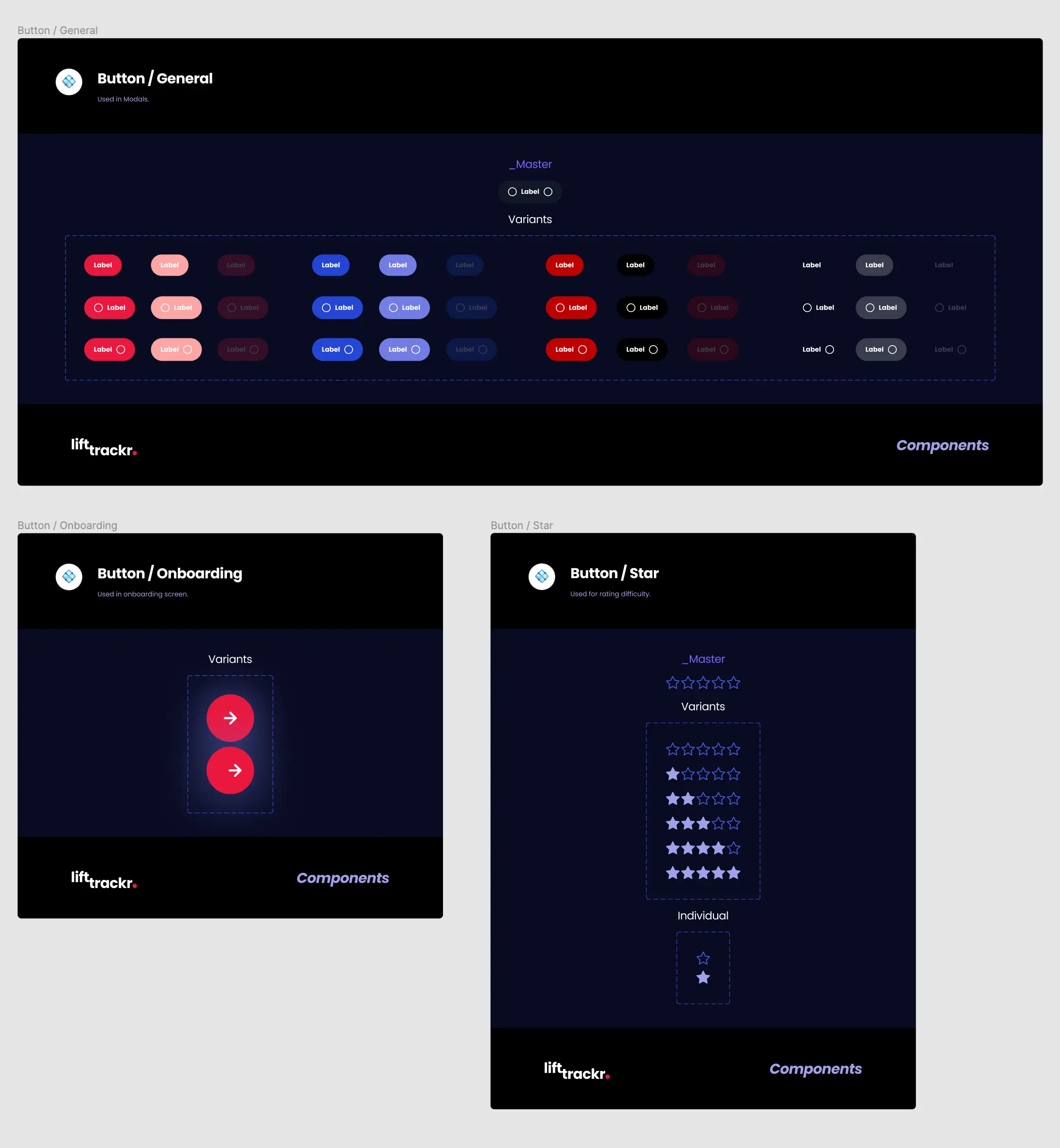
There are 4 roles (Primary, Secondary, Destructive, Inactive) and 3 states (Default, Pressed, Disabled) for each button. I began designing buttons by following Apple's HCI guidelines, and choosing roles and states that are familiar to most users.
Roles define the button's purpose throughout the app.
Primary buttons typically represent the most important and prominently featured actions in the app's user interface. An example would be "Save before leaving?". Primary buttons are visually represented by Primary Red 500 (#EA2D4F).
Secondary buttons are used for less critical or secondary actions within the app's user interface. Examples include back buttons, alternative options, etc. Secondary buttons are visually represented by Secondary Blue 500 (#2445D5).
Destructive buttons are used for actions that result in the loss of data, such as deleting videos. The challenge here was that I limited my color palette to red and blue, and red is traditionally used for destructive buttons. For inspiration, I looked at other apps that also used red for primary buttons such as Yelp and Netflix. As a result, I decided to represent destructive buttons with the color Primary Red 600 (#C0005B). Since the shades of Primary red are duller while the base color has hints of blue, there is enough visual differentiation between the primary and destructive buttons when viewed side by side.
Inactive buttons are visually displayed as text only in order to provide a clear indication that they are not currently actionable.
6. Navbar
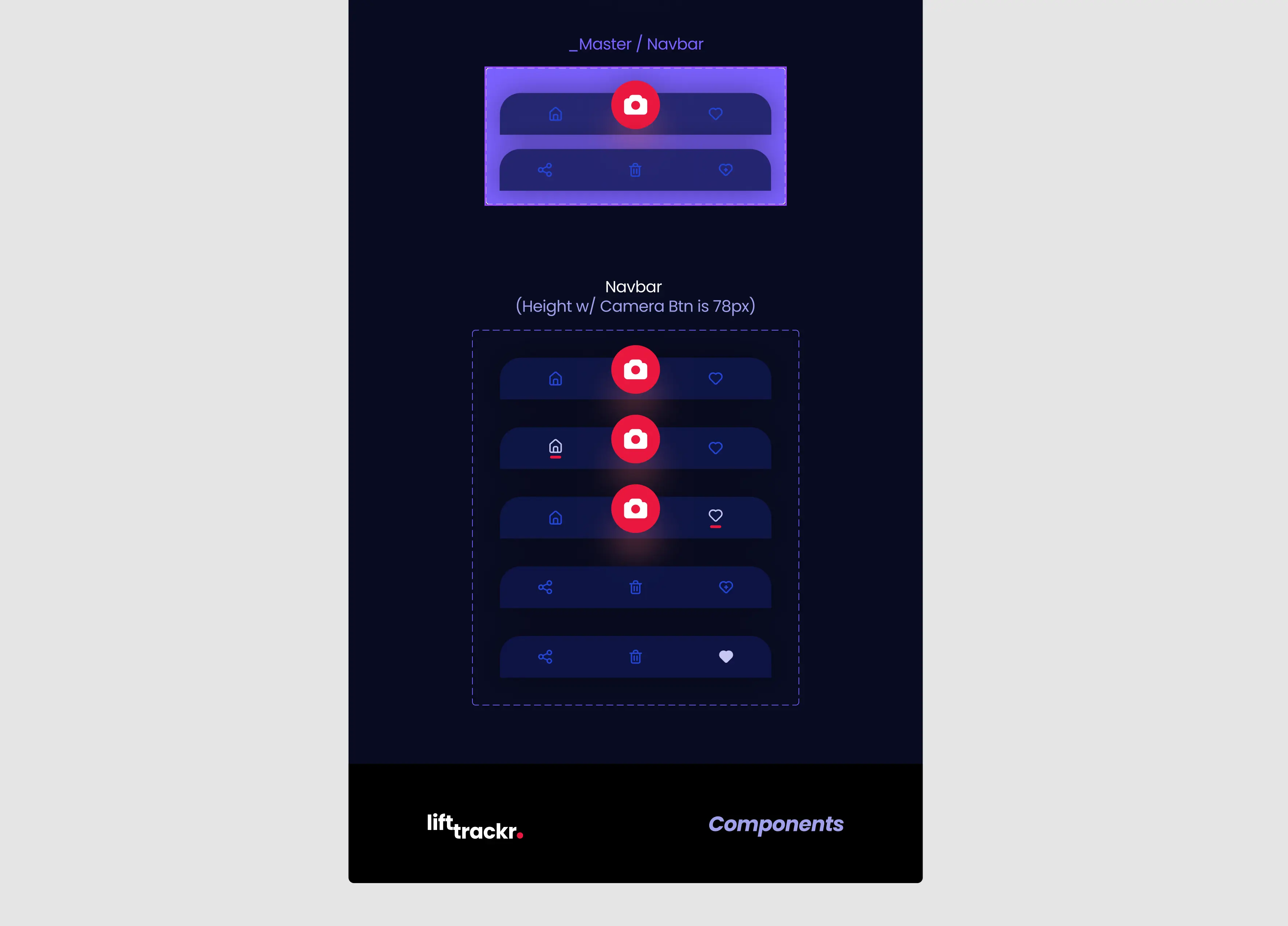
The Navbar is fixed to the bottom of the app, and allows the user to navigate to key screens such as home, favorites, and camera.
The Navigation state is the default state which includes the camera button, while context state has the camera button replaced with additional context-specific actions; since there are multiple minor variations of these states, I created the two navbar states as master components so that any additional changes will affect all variants.
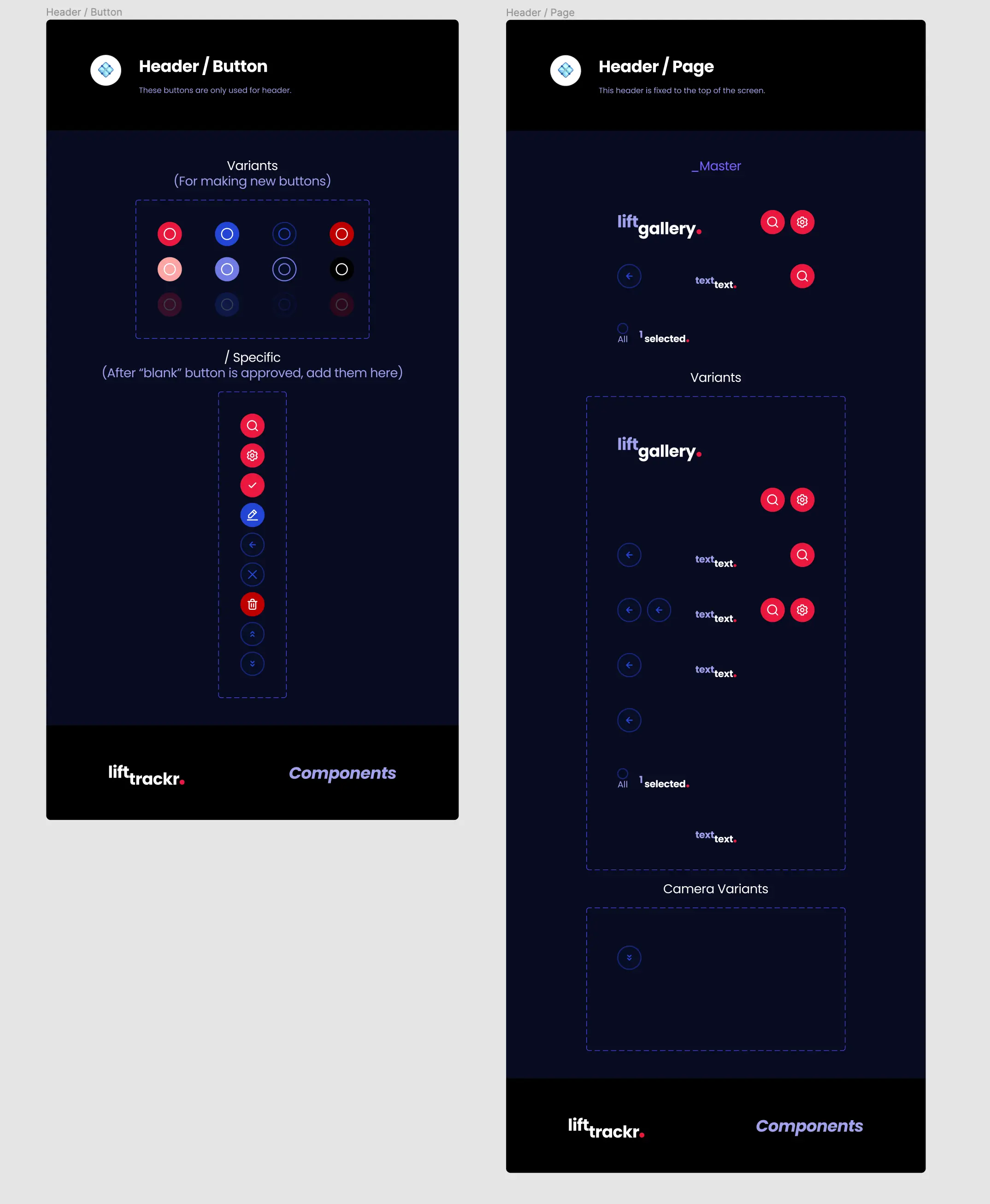
7. Header
The header is fixed to the top and contains section titles, back button, search button, and settings button.
The header section incorporates context-specific buttons, which are used exclusively within the Header—these buttons have the "Header /" prefix in their name so that other designers can find all related "Header" components grouped together in the library.
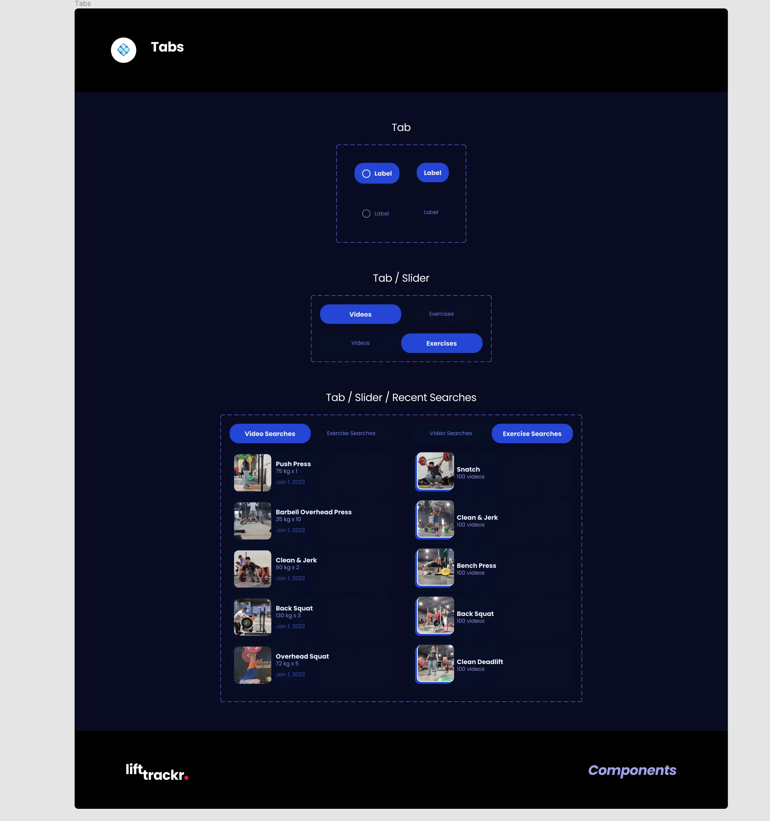
8. Tabs
Tabs serve as a way for the user to toggle between various sections within the same page/screen.
During the prototyping process I realized I needed the tabs to toggle between 2 list of items within the Search screen.
Since the Search screen has a transparent glass background that slides over the user's current screen, it creates a visual artifact when changing states during screen transitions.
As a solution, I created another specialized tab component named "Tab / Slider / Recent Searches" that has the related content included—by utilizing this component, the transparent glass background can remain static, ensuring no visual artifacts caused by screen transitions.
Prototype & Project File
Final prototype
and dev handoff.
After completing the wireframes and design system, I created the final design screens and made sure to add documentation for dev handoff. Click on the buttons below to view either the prototype or project file in its entirety.
Onboarding Process
With the help of my strong friends at SoCal Weightlifting, I created a video montage to engage the user during the onboarding process. When the user taps on the initial CTA button the video changes from monochrome to color, and back to monochrome during Sign in and Create Account screens.

Recording Your Lifts
Tapping on the record button in the bottom navbar will open the camera and allow the user to quickly record their lifts. LiftTrackr Advanced A.I. can be enabled to recognize the name of the exercise and trim the video.
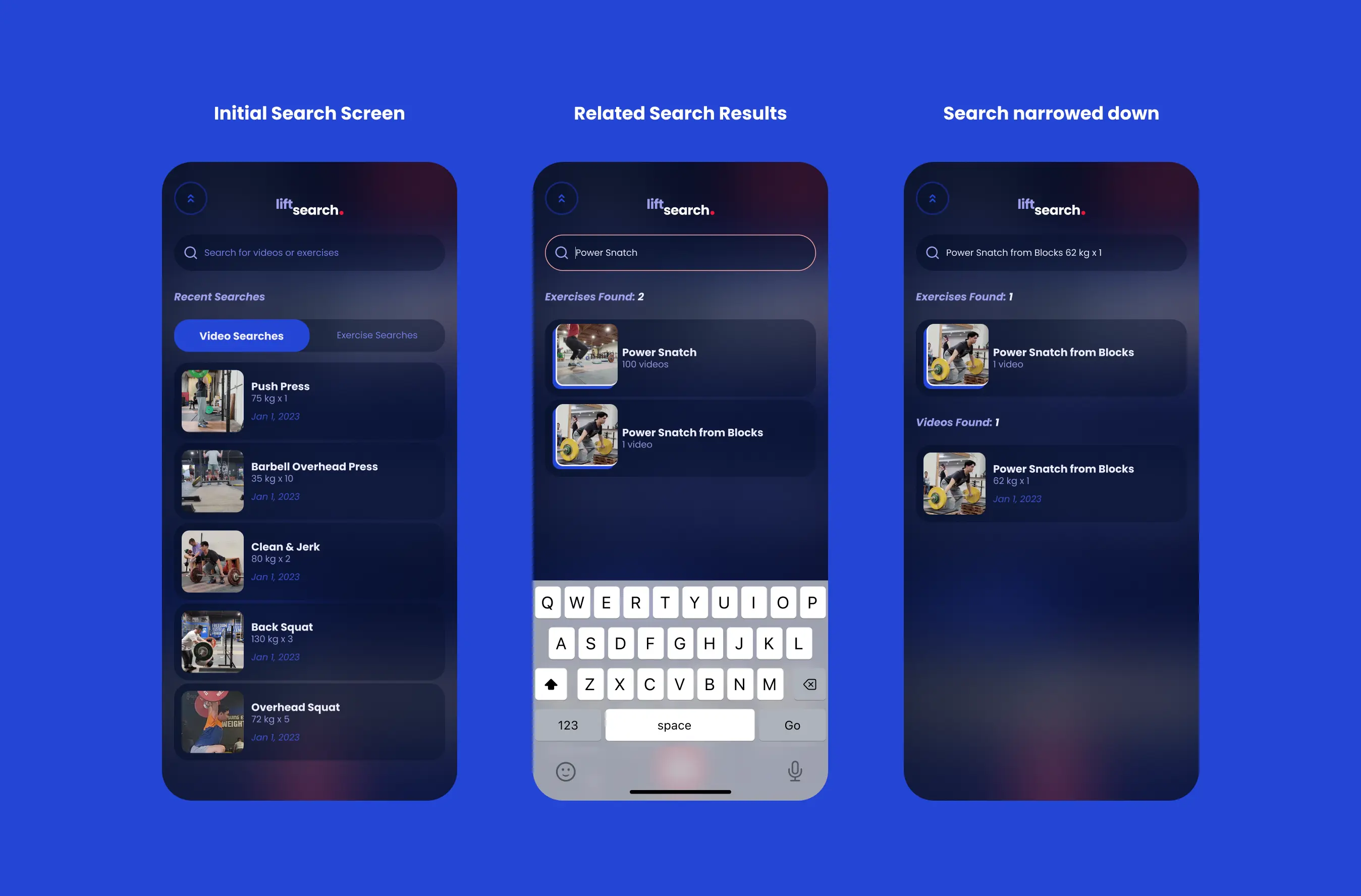
Video Search
Since every video has metadata logged, they can be quickly searched for by tapping on the search button in the top right corner.
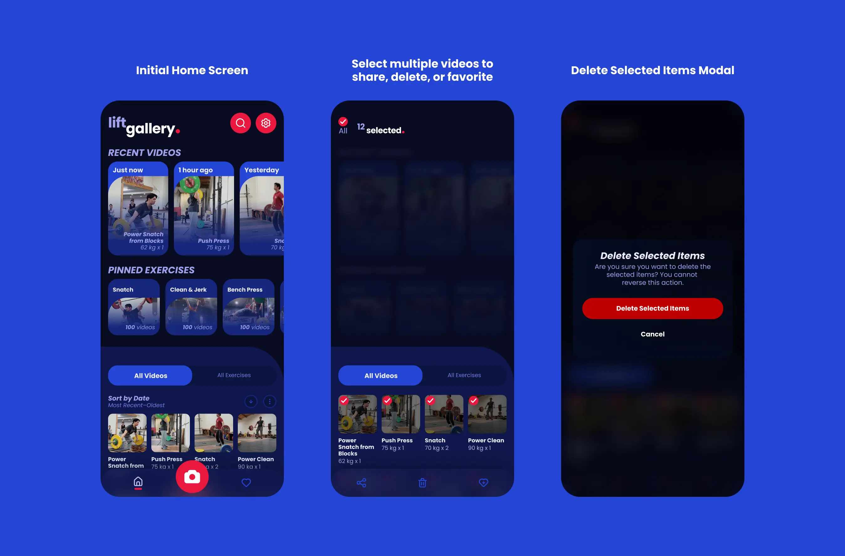
Manage your Videos
Videos can be easily managed by long pressing on a thumbnail to enter context mode—this will be familiar to users accustomed to other gallery apps.
Developer Handoff
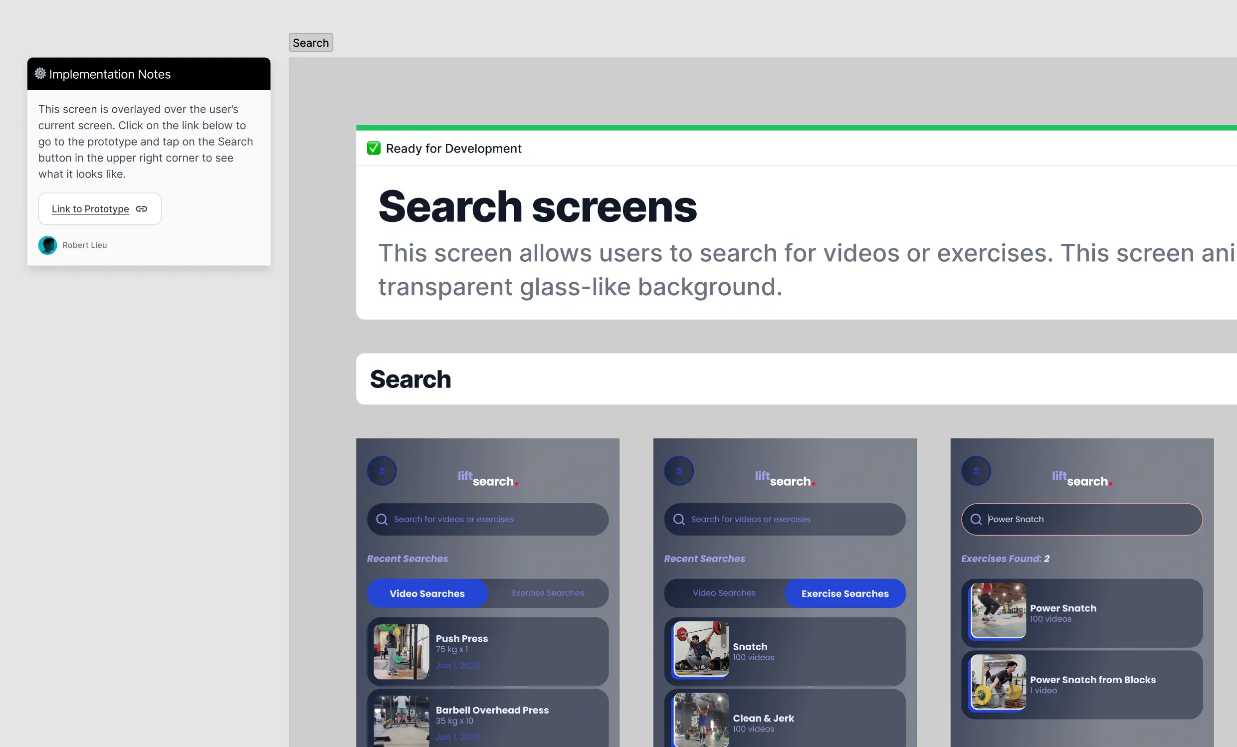
All screens are instances of component screens, so developers will always have the newest screens. Each screen is labeled with a description that explains what it is, and there are notes with links to assets or examples for developers.
However, it is crucial to run workshops with developers to go over the design implementation as handing over a Figma file with notes alone is not enough.
Lessons Learned
The hardest part of creating the design system and project file was figuring out the best practices for organizing screens and design assets in a way that is easy for developers to understand. For example, since I both designed and developed my website I didn't have to worry about this step—but when it comes to making design specifications understandable to developers, it's important to put yourself in their shoes.
Near the end of the process, I realized that all teams have different practices for handling design assets and there is no one size fits all—therefore I focused on the basics such as having an individual design system file, individual project file, and labeling each individual flow.
